A corporate identity…
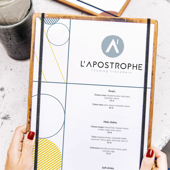
Vitamin-charged colors
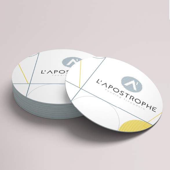
A navy blue/gray palette livened up by lemon yellow plus a stripe to add pep and energy.
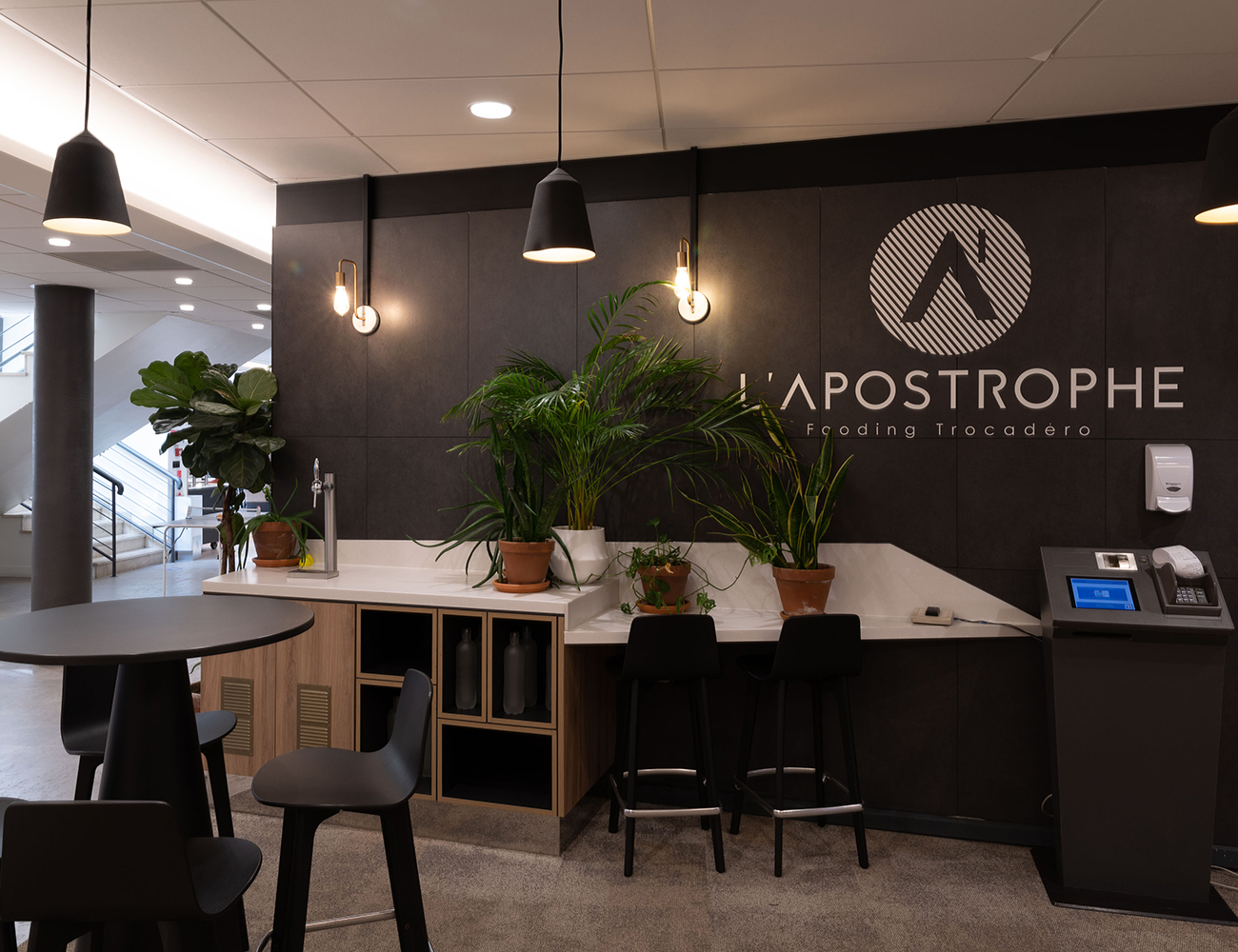
Kotska accompanies Union Investment by creating the name and identity of the inter-company restaurant for the Paris Trocadero Business Center.
The idea was to impose a contemporary, soft, cozy rhythm for a playful, elegant fooding experience.

Imagine an identity in keeping with the Paris Trocadero Business Center’s values that is embodied by the restaurant. The new location must resemble a food lover’s place, a calm, literary universe with an updated Art Deco character, an elegant fooding experience.
A unique identity with a modern, curved, status logo in a geometric game resembling an updated Art Deco motif.

A navy blue/gray palette livened up by lemon yellow plus a stripe to add pep and energy.

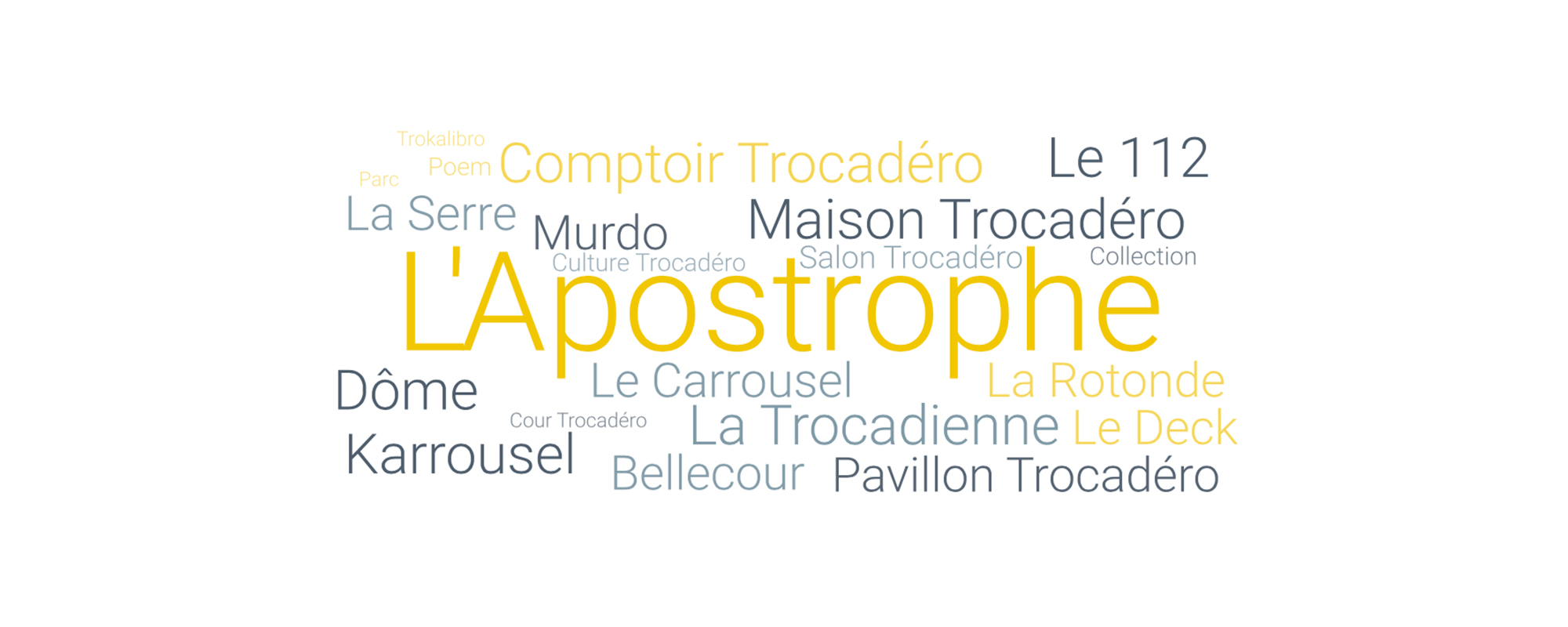
The apostrophe worked in different ways for a playful mix as with the different flavors we find in the menu.
To incarnate elegance and good food
An identity developed on various grounds
Emphasize the location